Introducing BrandingRepo (for Rails)
Ever had the problem that you reuse the same project for a managemable number of clients? Too few to store branding materials in a database, but more than one making it hard to keep separate branches in sync?
Introducing BrandingRepo (for Rails)
The idea is simple: create a configuration file with those files that are specific to different brands/customers and store their mods in a different repository. Repository is quite a big word here: we simply create a config/brands folder in your current branch where you can push and pull your brand specific adjustments from. All managed in the same git repository.
What it is not:
- it is not git within git.
- it is not a design system, nor has it anything to do with it (I think perhaps with a few additional hacks it can be made to work with centrally managed gems/node-modules; like here: https://twitter.com/hopsoft/status/1451358882161332225?s=10)
- it is not adding brand icons to your project
Installation
Add this …
- mastodon 07 Dec iOS is still pretty flat, b...
- shared 17 Nov "what are all the actions or verbs that are going on here?" (snippet from a React-documentary)
- delicious 05 Nov The Component Gallery
- delicious 05 Jun I helped pioneer UX design. What I see today disturbs me
- shared 12 May How inclusive user research makes your products better
- delicious 03 May Principles and priorities
- delicious 03 May A UX/UI Case Study on Spotify
- delicious 30 Apr The Design of Forms (online remaster)
Design Systems and the source of truth
Some excerpts I created from the transcript of the Design System Podcast, hosted by Chris Strahl, which in Episode 11 featured Brad Frost and Evan Lovely.
Hand-over of comps
The traditional process starts with the design of comps, comps, non-interactive previews, which are generated by the design team and undergo a rigid design review process up to a design director or VP, and is only then passed on to the developers who need to implement that initially static comp pixel perfect. But Evan Lovely notes that while there is nothing wrong with comps, there is something wrong with mistaking it for the final product. That’s why he likes tools like pattern lab, storybook or knapsack, because they really allow someone to quickly mock up a comp that actually works within the final environment.
To some companies this is a problem; because the formal approva…
- delicious 26 Jan The Challenge of Identifying UX Success Metrics
- shared 20 Jan a11yresources - A growing list of accessibility tools and resources
- delicious 20 Jan CSS Guidelines (2.2.5) – High-level advice and guidelines for writing sane, manageable, scalable CSS
- shared 20 Jan Prevent layout shifts with CSS grid stacks - Hubert Sablonnière
Highlights from the Atomic Design book by Brad Frost
Since his talk at Fronteers I was interested in the thinking of Brad Frost, his blog posts, etc., but never actually read his book Atomic design until recently, as it got more and more relevant to an internal discussion at an organization I was working for. A few notes:
- Most importantly, what it is not: Atomic Design is not about being a practical guide for implementing design systems (although it has some examples in Pattern Lab, which was originally built by him). I was also hoping it would also give guidance on naming things / structuring CSS when building atomic design based design systems, but it does not. But don’t mind, plenty of good content(!)
- Atomic design sounds like an too obvious idea and while I didn’t dismiss it because of that, I realized I also didn’t try to understand it thoroughly enough. Reading the book helped me to better understand it and especially thinking about the intermediate forms (molecules) was actually despite its o…
- delicious 12 Oct Website Style Guide Resources
- delicious 12 Oct a11yresources
- delicious 29 Jun What are design tokens?
- shared 28 Mar Responsive Grid Magazine Layout in Just 20 Lines of CSS
Relative font sizes, or pixel based? 2020-edition
Occasionally I still have discussions about px-based font sizing, feeling like the other party has lived under a rock since early 2000's. But some designers still like their pixel based tools; maybe it even got popularised again by relatively new tools like Sketch and Figma, introducing pixel-units in a vector-based tool.
Well, to be honest, it matters less these days when compared to the days I learned that pixels are bad. Those days browsers were enlarging only text when it used relative sizes. In response to not all sites serving relative font siz browsers have introduced full page zoom functions, which is common place these days, when you press Command/Control plus ‘+’ everything will scale; text images etc.
But the text-size function is still used. In Firefox, Settings > General > Language and appearance sets the default font-size. In Chrome: Settings > Appearance > Lettersize. When you’re young and able you probably wouldn’t need to know about these things. But we shoul…
- delicious 24 Jan Privacy By Design / IRMA
- delicious 10 Oct Conway's law
- delicious 20 Sep Contrast widget
- delicious 20 Sep Quick Design History: Otl Aicher
- shared 13 Aug Creating an SVG path drawing animation.
- shared 14 Jul Seeing the Pages For the Components
- delicious 08 Jul Left-leaning italics
- shared 17 Jun other web
- twitter 12 Mar RT @vlh: A great read on the current state of web accessibility from @beep:
Don't try to be more personal
Your persona's don't include someone who is visually impaired Your persona's are probably all white, or typically young and dynamic. None of your persona's went through a tragic event recently.
Be careful when creating emotional experiences for the lucky ones. You shouldn't congratulate everyone with another great year, and/or a better year to come. Don't try to be more personal than you can be.
See also this thread on persona's
- twitter 14 Feb Interface Copy Impacts Decision Making
- delicious 24 Jan Brands: Beyond the interface
- delicious 27 Dec ´18 CheckTLS (for e-mail)
- delicious 27 Dec ´18 Select CSS
- shared 06 Dec ´18 Should I Use JavaScript to Load My Web Fonts?
- shared 25 Nov ´18 Just-in-time Design
Delay your decisions
I design very little upfront. Sometimes I need to make an estimation, I design a little more. Sometimes the project is hardly specced and there is a lot of exploring to do.
In this post I would like to give a demonstration of how a recent project developed.
Initial stage
> Client: “We want a fancier frontend for our data”.
> Me: “Sure, any limitations?”
> Client: “We give you 4 months”
> Me: “Can I use any tech I want?”
> Client: “Na, we want to be able to continue on what you’re going to create, so please use P, X, Y and/or Z.”
> Me: “Sure, P is not my favourite, but some time ago I’ve dealt with it, so ok, we keep it simple anyway.”
The plan that followed:
Initially I thought I could fancy up the CSS, but the old product was in a very bad state and not really maintainable. So I decided to create a thin API layer in P (yes of PHP), a modern front-end layer in JavaScript using a framework that I co-introduced in the organisation a few years ago (R…
- shared 31 Oct ´18 What Can Bike Sharing Apps Teach Us About Mobile On-boarding Design?
- shared 18 Oct ´18 For the love of God, please tell me what your company does
- delicious 30 Aug ´18 Brutalist Web Design
- twitter 11 Aug ´18 "Most specs I've seen represent a solution, not intent"
- twitter 07 Aug ´18 Implications of using persona's
- twitter 05 Aug ´18 RT @thijs: Excellent approach (Re: Products Are Functions)
- twitter 05 Aug ´18 RT @ConsumPsy: [BLOG]: "Could the Breadcrumb Technique Help Boost Your Landing Page Conversions?"
- shared 06 Jul ´18 Design for an “Audience of One”
- shared 30 Jun ´18 Visual Agility: Why We Model
- shared 17 Jun ´18 Hofstede Insights - Country comparison
- delicious 28 May ´18 Resilient Webdesign
- delicious 28 May ´18 Priority Guides: A Content-First Alternative to Wireframes
- shared 17 May ´18 In the lab with Xbox’s new Adaptive Controller, which may change gaming forever
Variable fonts
Last decade the web has been catching up with print. The advent of better delivery formats for type (WOFF(2)) and the rise of services such as Typekit and Google Fonts made the web for typography as interesting as print. But now a new specification is gaining popularity, and it may make the web more interesting than print: variable fonts.
Some background: In word processors you can typically choose between a few basic type variants Bold, Italic and Bold Italic. Some types appear with a 'Black' or 'Light' version in the font list. More professional products for graphic professionals (think Illustrator, Indesign, QuarkXpress), paired with a complete font-family, are, however able set type using 'font-weight'. While CSS has a font-weight-property, offering 'variable' weights (typically rounded to the nearest 100) to a web page would make that page load much slower.
…
- shared 27 Dec ´17 Inclusive Components
- delicious 03 Sep ´17 Feather - Simply beautiful open source icons
- twitter 29 Aug ´17 “The Nine Principles Of Design Implementation” https://murb.nl/feed_items/8681?utm_source=twitter&utm_medium=share_link&utm_campaign=social #css #design
- shared 29 Aug ´17 The Nine Principles Of Design Implementation
- twitter 06 Aug ´17 “The Back Up Question: Defining a Project’s ‘Good Enough’” https://murb.nl/feed_items/8639?utm_source=twitter&utm_medium=share_link&utm_campaign=social #design #ux via @murb
- shared 06 Aug ´17 The Back Up Question: Defining a Project’s ‘Good Enough’
- delicious 31 Jul ´17 How To Protect Your Users With The Privacy By Design Framework
- twitter 15 Jul ´17 "Despicable Design – When “Going Evil” is the Perfect Technique" https://articles.uie.com/despicable-design-when-going-evil-is-the-perfect-technique/
Bereik meer met toegankelijkheid: inclusive design
Meer mensen bereiken, waarom dan niet alle mensen? Een paar weken geleden volgde ik een cursus van Peter van Grieken van Frozen Rockets. Hij wees ons er op dat 300.000 mensen in Nederland slechtziend of volledig blind zijn. Daarnaast zijn er bijna 700.000 mensen die kleurenblind zijn en dan hebben we 825.000 dyslectici en 1,5 miljoen laaggeletterden nog niet geteld. Doe je veel met video of geluid dan is het belangrijk om te weten dat er ook nog eens 1,3 miljoen mensen slechthorend of doof zijn. En dat naast 1,5 miljoen lichamelijk beperkten. Dat zijn 4 miljoen mensen met enige vorm van beperking (bron).
Screenshot van het project "Wayfinding for the blind", een onderzoek dat ik tijdens mijn studie (2006) mede had opgezet op de TU/e.
Het was schokkend om te zien dat zelfs grote sites als die van CoolBlue eigen…
- delicious 12 Jul ´17 5 onmisbare tools voor toegankelijk kleurgebruik
- shared 29 Jun ´17 Combining Typefaces by Tim Brown
- delicious 26 Jun ´17 IcoMoon App
- delicious 25 Jun ´17 Climacons
- delicious 25 Jun ´17 168 free custom interface icons
- delicious 08 May ´17 CSS Font Stack
- delicious 23 Apr ´17 A11 Style Guide
- twitter 28 Mar ´17 "Plainness and Sweetness" #design https://www.frankchimero.com/blog/2017/plainness-and-sweetness/
Be careful with what you ask for
Since we all seem to know that every other field in the registration form is another percentage of users failing to register*, we think of alternative ways to gather information. We gamify the user profile completeness by adding a progress bar to our user account, we present a full form after the confirmation link or we ask questions while using the application.
But there is another reason why we might not even ask all the questions. Ask the wrong questions and you may alienate your user.
It can be relatively minor things like picking your favourite colour, where the form just lets you pick one colour, while many have multiple. But it may also be more personal (or one could argue, more political): not everyone defines oneself as male or female, so why only present just these options (and do know that it isn’t particularly nice being referred to as ‘the other’ all of the time).
These issues are well discussed in this [talk by Ca…
- delicious 22 Aug ´16 Hello Color
De principes van murb
Toelichting: Niet iedereen maakt applicaties op dezelfde manier. In de loop der jaren heb ik wat principes ontwikkeld waaraan ik mij probeer te houden wanneer ik oplossingen realiseer. Het zijn handvatten waaraan ik mijzelf probeer te houden. Ik hoop ook dat opdrachtgevers mij hieraan helpen herinneren mocht het, vergeef me, toch nodig zijn. Vandaar deze openbare declaratie.
Simpel
Ook het idee dat zaken veelal onnodig complex gemaakt worden? Het komt maar al te vaak voor dat IT-bedrijven oplossingen willen bouwen die geschikt zijn voor alles. Maar dat heeft een prijs: complexiteit. De software van murb is eenvoudig in het gebruik en ook nog eens goedkoper aan te passen aan jouw wensen.
De eindgebruiker staat centraal
Heb je het gevoel dat de gebruiker wordt vergeten bij lange lijsten met features? Er wordt door murb in de eerste plaats gewerkt aan gebruiksvriendelijke oplossingen. Met een duidelijke mens-machine-interactie en interactieontwerp achtergrond st…
- twitter 19 Aug ´16 "Creativity Under The Microscope: Running A #UI #Design #Critique" https://www.smashingmagazine.com/2016/08/running-a-ui-design-critique/
Notes: How to Hack PR for Your Startup
Just attended a free webinar (replay) from Founder Institute: “How to Hack PR for Your Startup”. Here are some of their (Adeo Ressi (FI) and Conrad Egusa (Publicize.co)) main takeaways:
- Make sure you have a great design, no-one needs to tell you that
- FAMOUS
- Formulate the announcement: Make sure you’ve got news when you approach TechCrunch etc;
- Amplify your dreams; Let’s go to Mars!
- Messaging: the press release; make sure to make it as easy as possible: $20 /article; E-mail pitch (sell), press release is the make it easy to write. Make sure you use social proof, interesting stuff that adds to an interesting tool. Link your LinkedIn, Twitter etc. “Hi I’m Maarten (LinedIn, @murb”.
- Make sure you follow up, but don’t spam
- Don’t sell!
- Own:…
- delicious 27 Jul ´16 10 great sites for ui design patterns
- delicious 27 Jul ´16 Affective Computing
User vs usage friendly
In English usability folks typically talk about user friendliness. Literally translated, user friendly translates in Dutch to "Gebruikersvriendelijk". In Dutch "Gebruikersvriendelijk", however, is used interchangeably with “Gebruiksvriendelijk” (see also: Taaladvies) which translates literally back to “usage friendliness”. Not too fast: these might be two different concepts after all.
English Dutch User friendly / gebruikersvriendelijk 61,300,000 622,000 Usage friendly / gebruiksvriendelijk 5,930 250,000 Ratio 1 / 10.000 5 / 2Table: Google’s frequency counts for the different languages
User friendly
User friendly is about being nice to the user. Making something user friendly may be about nice icons, nice words, nice visual design, but you can, strictly speaking, still be very friendly and not allow a user to accomplish a certain task.
…
Lost identity: Facebook's Instant Articles
Admittedly, I was a sceptic from the start when Facebook announced its instant articles with its promise to deliver blazingly fast loading articles. The technology would be ideal for publishers who'd want to deliver the best experience to their end users on Facebook. I wondered: why couldn't publishers simply remove all third party clutter and make their own sites blazingly fast? But that is not what I want to discuss here. The Guardian was one of the first news papers to implement the new Facebook Instant Article technology. The thing that disturbs me is that the blazingly fast speed comes at a price: loss of identity.
In recent years the web has become more and more a place where design can thrive. HTML5, CSS3, web fonts… the possibilities are endless these days. Designs of the web outlets of major publishers are on par with their traditional paper-based designs. Which makes that even details in the article's mark-up …
Save icon 💾
Not so long ago I was back in an organisation that was using Outlook Webmail. It may not have been the latest & greatest but I noticed this server (semi-cloud) based e-mailing app still used a floppy as a save icon. Being a mac user for years it felt weird…
As you can see the icon that the webmail client features is a floppy
I didn't pay much attention to the issue, until my friend lent me his Windows-phone:
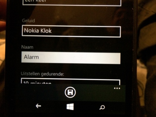
This total redesign (Metro-style) of how a phone could work and look still featured a floppy icon(!). And even though I'm not a skeuomorphism-hater, I prefer the simple label "Save" that Apple uses in iOS. The floppy icon on a Windows telephone is completely alien to the device. I guess you've all seen the joke about the 3D printed save icon somewhere?
Still, do a [simple Google image sea…
- twitter 01 Apr ´16 @murb insight by my much smarter girlfriend ;)
- twitter 01 Apr ´16 Good read: “Design for Real Life” - the medium you're designing is the message http://alistapart.com/article/design-for-real-life-interview-with-sara-wachter-boettcher
Semantics before anything else
My first rule in styling websites or applications is to style semantics over anything else.
- First use as much of the agreed upon tags and properties that the latest HTML spec gives you
- Extend this with microformats or schema.org-vocabularies and what else you can find that is an (pseudo-)standard for semantic markup
- Finally, if no matching semantically rich descriptors can be found, try to think of future proof names for your elements that may be reusable. Think "metadata div(vision)”, "(search) result" (you may style result here and add another more specific styling for search results).
Style the semantical markup. Semantics is about meaning, and by defining your content's meaning in html and highlighting this meaning with your style brings you consistency from the start. This is not only nice to you as a maintainer of code, but also to your audience. It leads to consistent, predictable behaviors.
The counter movem…
- twitter 08 Feb ´16 .@baekdal nails it again: #design for the right moment, don't throw #content at your #users https://www.baekdal.com/insights/publishing-in-a-digital-native-world/7A496C53201849F29DB77576F0B02410FA596451B217550293ABB3B98A6DD0DC #ux #publishing
- twitter 08 Feb ´16 .@baekdal nails it again: #design for the right moment, don't throw #content at your #users https://www.baekdal.com/insights/publishing-in-a-digital-native-world/7A496C53201849F29DB77576F0B02410FA596451B217550293ABB3B98A6DD0DC #ux #publishing
- twitter 20 Jan ´16 Recommended read: "Motion with Meaning: Semantic #Animation in Interface #Design" http://alistapart.com/article/motion-with-meaning-semantic-animation-in-interface-design
- twitter 20 Jan ´16 Recommended read: "Motion with Meaning: Semantic #Animation in Interface #Design" http://alistapart.com/article/motion-with-meaning-semantic-animation-in-interface-design
- twitter 16 Nov ´15 #IBM’s #Design-Centered Strategy to Set Free the Squares #ux http://rss.nytimes.com/c/34625/f/640387/s/4b7fb47b/sc/28/l/0L0Snytimes0N0C20A150C110C150Cbusiness0Cibms0Edesign0Ecentered0Estrategy0Eto0Eset0Efree0Ethe0Esquares0Bhtml0Dpartner0Frss0Gemc0Frss/story01.htm
- twitter 26 Mar ´15 Too obvious: don't #design from an ivory tower but with users and foremost in close #collaboration with builders #ux http://uxmag.com/articles/4-techniques-of-successful-ux-executives
- twitter 16 Mar ´15 A follow up post: “Should everything be designed invisible?” https://murb.nl/articles/218-should-everything-be-designed-invisible- #noui? #invisible #design
- twitter 24 Feb ´15 (related to the prev tweet) A few weeks ago I gathered some definitions on #invisible #design: https://murb.nl/articles/216-invisible-design
- delicious 06 Nov ´14 Styling And Animating SVGs With CSS | Smashing Magazine
- delicious 08 Aug ´14 Agile Modeling (AM) Home Page: Effective Practices for Modeling and Documentation
- delicious 03 Apr ´14 Content-out Layout
- delicious 11 Feb ´14 Pattern Library | MailChimp
- delicious 11 Feb ´14 Pattern Primer
- delicious 11 Feb ´14 Responsive Web Design Patterns
- delicious 12 Nov ´13 iOS7 GUI for Sketch (iPhone) | Teehan Lax
- delicious 25 Oct ´13 Snap.svg - Home
- delicious 10 Sep ´13 Interviewing Humans · An A List Apart Article
- twitter 04 Sep ´13 RT @jr_carpenter: Ornate oak cabinet carved to look like a distorted digital photo: http://www.dezeen.com/2013/03/14/good-vibrations-distorted-cabinet-ferruccio-laviani-fratelli-boffi/ #design http://t.co/GMOgyMolNv (…
- delicious 30 Aug ´13 Font Hacking
- delicious 06 Aug ´13 Butterick’s Practical Typography
- delicious 22 Mar ´13 Pencil Project
- delicious 08 Mar ´13 Breaking down Amazon’s mega dropdown - Ben Kamens
- shared 07 Feb ´13 Great Design Always Means Great Style (Misc Magazine) - jnd.org
- delicious 24 Nov ´12 Subtle Patterns | Free textures for your next web project
- delicious 11 Nov ´12 Fitting Big-Picture UX Into Agile Development | Smashing UX Design
- delicious 30 Jul ´12 Fonts In Use – Type at work in the real world.
- delicious 30 Jul ´12 Fonts In Use – Type at work in the real world.
- delicious 22 May ´12 Pencil Project
- delicious 22 May ´12 Pencil Project
- delicious 18 Apr ´12 Color Scheme Designer 3
- delicious 18 Apr ´12 Color Scheme Designer 3
- delicious 06 Feb ´12 Integrating UX into the Product Backlog - Boxes and Arrows: The design behind the design
- delicious 06 Feb ´12 Integrating UX into the Product Backlog - Boxes and Arrows: The design behind the design
- delicious 27 Jan ´12 Home - Dark Patterns
- delicious 10 Nov ´11 Redesigning The Country Selector
Dit artikel van murblog van Maarten Brouwers (murb) is in licentie gegeven volgens een Creative Commons Naamsvermelding 3.0 Nederland licentie .