Lost identity: Facebook's Instant Articles
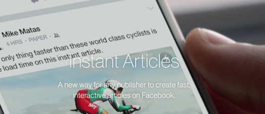
Admittedly, I was a sceptic from the start when Facebook announced its instant articles with its promise to deliver blazingly fast loading articles. The technology would be ideal for publishers who’d want to deliver the best experience to their end users on Facebook. I wondered: why couldn’t publishers simply remove all third party clutter and make their own sites blazingly fast? But that is not what I want to discuss here. The Guardian was one of the first news papers to implement the new Facebook Instant Article technology. The thing that disturbs me is that the blazingly fast speed comes at a price: loss of identity.
In recent years the web has become more and more a place where design can thrive. HTML5, CSS3, web fonts… the possibilities are endless these days. Designs of the web outlets of major publishers are on par with their traditional paper-based designs. Which makes that even details in the article’s mark-up are now being used to (subconsciously) signal the identity of its source.
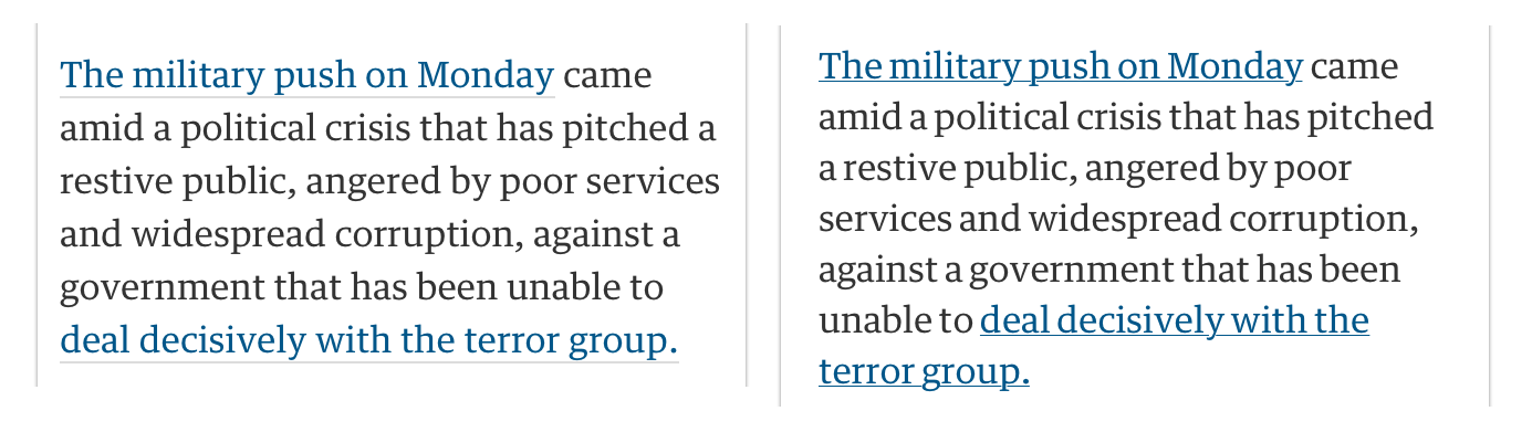 Figure 1: Screen-shots of the same Guardian post: Original left, Facebook Instant Article right
See for an example Figure 1. The left was what I was used to. Note the line-spacing and most notably the grey underline that is below the text. Its really in the details, as it should be, but it signals “Guardian”.
For those with a less trained eye for design details it may not be so apparent, but I believe the design details subconsciously transfer identity and give an idea of where the story comes from. It adds trust.
As said, it is perfectly possible to create fast loading webpages. And it would’ve been perfectly possible for Facebook to prefetch these webpages as it does with the instant articles. Instead, Facebook decided to abuse its power: persuading publishers to reformat their articles in their Instant Article format making all publishers look the same (again). Its a regression.
Update: This is how a Facebook designer thinks about this topic:
“Once we operate inside of iOS or Android, those ecosystems have design rules that are laid out for us. If I use Google’s material design, it dictates that when you touch, a button rises up to meet your finger as opposed to depressing it. They figured out: ‘This is the way the system should behave.’”
Imagine all magazines, store fronts, houses, to look the same…
More screenshots
Below you can have a look for yourself, see for example the change in line height for the New York Times. Left is the web-version, right the Facebook Instant Article. Also notice how similar both the NYT and Guardian articles look in their Instant Article style.
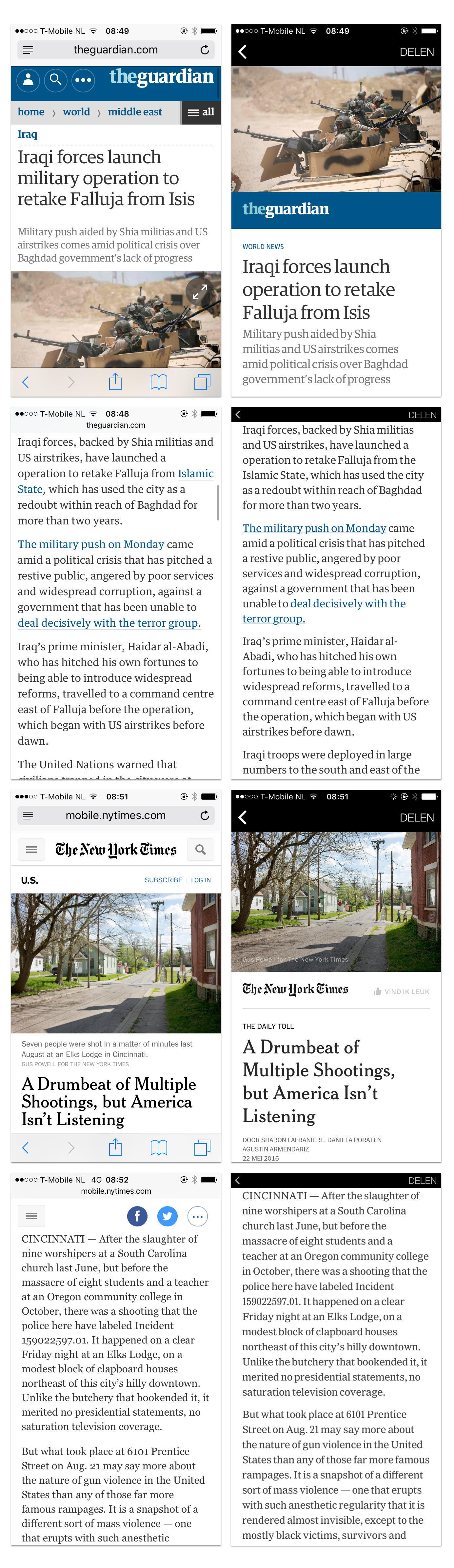 Figure 2: More comparisons, the Guardian article and a New York Times article: Original left, Facebook Instant Article right
Enjoyed this? Follow me on Mastodon or add the RSS, euh ATOM feed to your feed reader.
Dit artikel van murblog van Maarten Brouwers (murb) is in licentie gegeven volgens een Creative Commons Naamsvermelding 3.0 Nederland licentie .