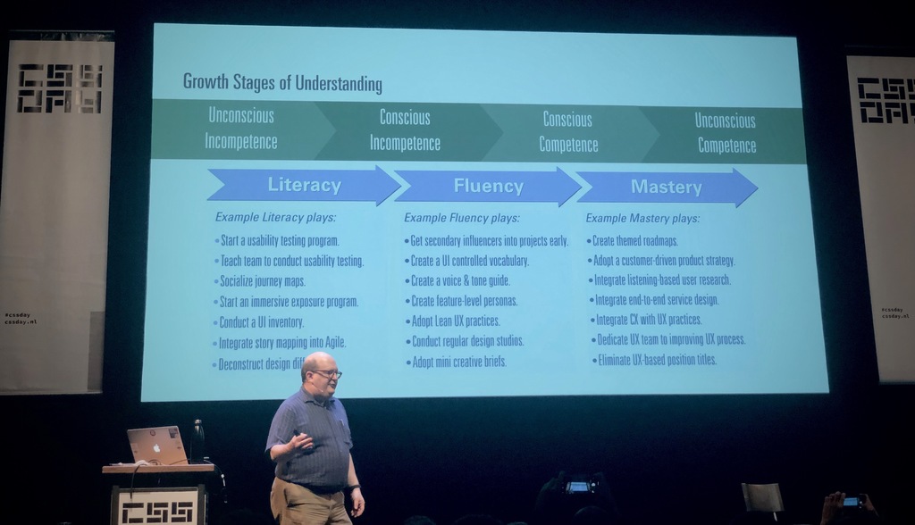
Yesterday I attended the CSS Day conference. This year only the first day, that focussed on designing user interfaces, less the building of it. Here are the key take aways for those who thought going through all slides is too long, or didn’t went.
Josh Clark - A.I. is your New Design Material
Josh urged designers to get feeling for the new design material called AI, the next big thing. We need to know what makes it different, the grain, and also know how we can use it for good. Design might have a seat at the board table, but they need to know how to align user considerations with business goals. More on AI and design by Josh Clark and more.
Steph Troeth - Behind the story
Storytelling used to be all the rage before mobile entered the scene, Steph recalls. Nevertheless, people prefer stories over plain lists of…
- delicious 09 Nov Classic HCI Demos
- shared 30 Jun ´18 What Google Learned From Its Quest to Build the Perfect Team
- delicious 19 Nov ´17 PhantomCSS
- twitter 06 Jan ´17 Halverwege februari weer tijd voor een nieuwe freelance-opdracht! #frontend #rails #ruby #interaction -> #fullstack
Should everything be designed invisible?
In an earlier post I wrote about invisible design and it might have seemed that I am a big proponent of invisible design. It is, however, important to distinguish between invisible design as a design approach where designery attributes are not being articulated and design where the sole purpose is to design experiences with no user interface at all. (Visible) user interfaces may actually play an important role in creating seemingly undesigned and invisible experiences by making them frustration- and stressless; invisible can be frustrating.
Invisible can be frustrating
The technology that powers the promised invisible interaction is not really “just not there”. To understand how something works it is sometimes good to reveal something about how it works, instead of hiding it away. Especially since every now and then, how well designed a system may be, ‘errors’ can occur. These errors may be technical errors, but also…
Invisible design
Wired explaining that the movement towards invisible design1 should be nothing new to desingers:
> In the early 1980s, Dieter Rams laid out his now canonical 10 Principles of Good Design. Rams taught us that great design is as little design as possible. It doesn’t draw attention to itself; it merely allows users to accomplish their tasks with the maximal amount of efficiency and pleasure. At its best, it is invisible.
btw: the link to a less secondary article was added by me, it is Ram's 10th principle
Wired is stretching Dieter Rams famous “less is more” design attitude to the logical max: nothing left (the extreme of less) is invisible. Hence follows: good design = invisible design.
Rams is popular among designers in de digital sphere. [Oliver Reichenstein, famous for his design agency iA and …
Click me! Click what?
Well, iOS has gone flat. We've, as interaction designers/human-computer interaction-specialists, traditionally been taught that a button should look like a button. And as we heralded Apple for its great interaction design some tend to be a bit sceptic / pissed.
The idea that something you could click on should look like a button comes from the idea of affordances; a button should expose the affordance of click-ability (or tap-ability if you like). More or less like a chair exposes the affordance of sit-ability, like a lying tree trunk does.
Affordance is a concept introduced in human-computer interaction by Don Norman in the late eighties who derived it from James Gibson. Don Norman's original reading on the concept has been popularized quite a lot, whereas James Gibson's work hasn't (at least not in interaction design-schools). But Gibson's idea of affordance was quite different from Don Norman's simplification. Later Don Norman revised his original concept of affordance…
- delicious 28 Oct ´11 Rands In Repose: Managing Nerds
- delicious 28 Oct ´11 Rands In Repose: Managing Nerds
- delicious 22 Jul ´11 Overdoing the interface metaphor – Marco.org
- delicious 22 Jul ´11 Overdoing the interface metaphor – Marco.org
- shared 11 Jul ´11 Pretend You Don’t Know
- delicious 16 Jul ´10 How to prototype iPad applications in 30 minutes or less using Apple keynote | Amir Khella
- delicious 16 Jul ´10 How to prototype iPad applications in 30 minutes or less using Apple keynote | Amir Khella
Wat een beetje murb al niet kan doen.
Mensen vragen mij wel eens wat ik doe. Zo’n gesprek loopt vaak uit in
schaamte weglachende opmerkingen over dat zij ook zo veel moeite hebben
met het gebruiken van de nieuwe apparatuur (veelal oudere mensen),
waarop ik gelijk op kan reageren dat dat nou precies is waar ik mijn
bijdrage denk te kunnen leveren. Jongere mensen reageren vaak zo van,
uhuh… (ze zijn immers alleswetend) en beginnen over coole gadgets,
waarna ze in de loop van het gesprek er ook achter komen dat de techniek
toch eigenlijk niet zo werkt zoals ze wilden dat die zou werken.
Techniek frustreert toch nog steeds te vaak. En dan kan dat ene apparaat
wel perfect werken, toch moet er vaak ook informatie van het ene
apparaat (lees ook b.v. software) naar het andere apparaat. En daar gaat
het, ondanks dat we in dit moderne leven zo vaak informatie
uitwisselen, nog vaak mis.Dus. Wat kan ik voor uw organisatie betekenen? Wel, volgens mij kan
een bedrijf op de lange termijn alleen maar succes…
Why we don't need multi tasking
Because computers can multi-tasks doesn't mean they should. People are actually quite bad at multi tasking. Computers, like any other tool, are made to support tasks. Make things easier to accomplish. Requiring users to multi task is far from supportive. Every interruption, which switching interfaces is, takes time to recover from. Hence, instead of promoting the idea of multi-tasking, computer makers should think more about completing tasks users are confronted with.
Instead of designing top notch 'solutions' for an entire 'office in a machine', computermakers should design solutions for a single clerk's job, or maybe even just a part of that job and find a way to nicely integrate in that clerk's job. Computers, or the softmachines powered by them, should be attempts to support an entire task without forcing the user to switch interfaces during task execution. Bad and good designs should be tested against the vision of perfect support for a single (ty…
Ubuntu vs. Mac
Preamble: This post was lying in my Google Docs account for
almost a year. Its time to publish it, because it may soon be
obsolete. The traditional OS, that focused on managing files on a disk
is disappearing. Mac OS X and Ubuntu are
becoming old generation OS'es if they don't
adapt to the task focussed applications
we see today.To the Dutch readers: Anders dan
mijn laatste
posts, een Engelstalige…
deze lag al
een tijdje
op de planken
en was geschreven in een periode dat ik nog twijfelde of ik nu in het Nederlands of het
Engels zou moeten
bloggen ;)I'm not the average Joe. I've studied
Interaction design, and a graduate in Human-Computer Interaction (about
the same as interaction designer, but with an extended theoretical
foundation :) ). I'm interested in what is going on in the software
world, and somewhat of an open source enthusiast, am even able to edit
configuration files to some extent, not afraid of searching
inaccessibl…
Invoeren van een geboortedatum
Sommige problemen zijn complexer dan ze op het eerste gezicht lijken. Geboorte datum invoeren bijvoorbeeld. Geboortedatum is van het type datum… dus geven we een datepicker, zo'n klein kalendertje waar je door kunt bladeren om een datum aan te wijzen. Dom. Blijkt toch niet echt te werken. Als je moet bladeren vanaf nu tot zeg in de jaren 70… dan heb je een lamme wijsvinger. Toch tekstinvoer dan maar? Het probleem is dat computers toch graag gestructureerde input krijgen. Mogelijk dat we binnenkort een standaard component hebben om alle mogelijke invoeren te ondersteunen, maar helaas, tijd is te kort. Dus wat is een goede oplossing. Een verslag van wat iteraties. Beperken van de input zodat de gebruiker niets anders in kan voeren dan verwacht wordt… mensen zijn geen machines!Iteratie 1: naamloze tekst invoer veldenHet oorpsronkelijke design bevatte drie velden, ongelabeld, waar een datum ingevoerd moest worden. Er was verder ook geen toelichting, behal…
- delicious 30 Jun ´09 Design Patterns At a glance » The Design of Sites
- delicious 30 Jun ´09 Design Patterns At a glance » The Design of Sites
- delicious 10 Jun ´09 Welie.com - Patterns in Interaction Design
- delicious 10 Jun ´09 Welie.com - Patterns in Interaction Design
Wednesday at The Next Web
Note: My ticket was sponsered by The Bean Machine I'm working for. Thank you!SoundCloudThe best talk of the day. Free is not important. Its about the bulb, not about the light. What happens around something is interesting. Any sufficiently interesting content is indistinguishable from cnotent. Kelly defines things that add value to something free. Context can 'make' (or the lack of context can probably break, ed.) the music. Relevance is defining the personal quality of music. The block buster approach doesn't work as well anymore. New schemes of music publishing arise. Use other people to help and promote your music, involve users in creation. Build relationships. Allow them, at a premium price, get additional material (e.g. multitrack version). SoundCloud makes it more accessible.3voor12Cool concept from 3voor12: FIY, film it yourself. Concert registrations done by combining video recordings from many.iMeemChaotic talk. API's, talk about the product, all mi…
- delicious 05 Feb ´09 InfoQ: Similarities Between Interaction Designers and Agile Programmers
- delicious 05 Feb ´09 InfoQ: Similarities Between Interaction Designers and Agile Programmers
The better interface: Is it about fun, or about identity?
Ryan, at the 37 signals' signal vs. noise blog, quotes an article at techradar about 'Why Apple is great at interfaces when others are not':I like how Nick draws a connection between good UI and ‘fun’. We don’t talk much about fun in usability circles.In the techradar article, elements like the nodding password entry box when a faulty password is entered, and other supposedly minor adjustments to the interface are making the interface more 'fun' to work with. But I'd say that that isn't really about fun, but has more to do with 'identity'? The computer can be made more personal with only slight tweaks. It can be made to have character.Fun to me is more like little features that may make you smile every now and then… that, however, doesn't make a great interface. Character, identity, on the other hand, could. It allows you to get to know the beast in front of you. Connect. Understand. Understandable interfaces make usable, user friendly, machines. Machines you…
Working @ the Bean machine
For little over a month, I'm working at a start up named 'the Bean Machine' based in Enschede, The Netherlands. It's a fresh new startup with a clear vision on project management: doing it with scrum. So if you were wondering where murb is hanging out, its over there. My ideas about agile development and how my passion of user experience/interaction design can be integrated in this development method are mainly posted at the beanblog (sorry, in Dutch only). I will try to post the interesting things on this blog as well… especially when I'm at a stage that I can really share best practices (I'm still learning).
ContextSonification
ContectSonification is another way of looking to adding sound to your computer environmen. This was my graduation Thesis for the European Media Master of Arts (EMMA) programme PrefaceThe first version of ContextSonifier was created in 2004 by Maarten Brouwers. It was the result of his Master-thesis: 'Context Sonification'. You can download his thesis here or just continue reading it in HTML format.The whole process has been supervised by:: Martin Lacet (thesis), Janine (project), Tom (project) and David Garcia (project) and was first published in Hilversum, August, 2004.When communicating from one human to another, visual, auditory and/or haptic cues are being used for communication. When communicating to another person directly a person communicates more than a plain message. It communicates also a state of being, a soul. Somehow also mechanical devices and environments are able to communicate this 'state of being'. Communicating not only in true/false messages. To…
Auditieve Mens-Machine Interactie
Note to English readers: This was my Bachelor Thesis (Interaction Design) on auditory interfaces. Since this text on auditory human technology interaction is in Dutch, you might be interested in my other text on this matter written in english (and more up to date too), it's title is context sonifier.InleidingDoelstellingMet dit document tracht ik zo'n breed mogelijk licht te werpen op de ontwikkelingen en mogelijkheden omtrent auditieve ondersteuning van een mens-machine interface. Het primaire doel is om een beter inzicht te krijgen in hoe een visuele interface uitgebreid kan worden met auditieve elementen. Mogelijk vloeien hier nieuwe ideen uit.Uniforme auditieve vormgevingWanneer men kijkt naar de bestaande richtlijnen voor dergelijke interfaces, als Microsoft Windows, Apple OS-X, KDE, dan valt het op dat er weinig tot geen aandacht wordt geschonken aan voorschriften die leiden tot een meer uniforme auditieve vormgeving van het systeem.ToepassingsgebiedDe toevoe…
Dit artikel van murblog van Maarten Brouwers (murb) is in licentie gegeven volgens een Creative Commons Naamsvermelding 3.0 Nederland licentie .