Invisible design
Wired explaining that the movement towards invisible design1 should be nothing new to desingers:
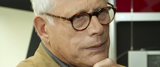
In the early 1980s, Dieter Rams laid out his now canonical 10 Principles of Good Design. Rams taught us that great design is as little design as possible. It doesn’t draw attention to itself; it merely allows users to accomplish their tasks with the maximal amount of efficiency and pleasure. At its best, it is invisible.
btw: the link to a less secondary article was added by me, it is Ram’s 10th principle
Wired is stretching Dieter Rams famous “less is more” design attitude to the logical max: nothing left (the extreme of less) is invisible. Hence follows: good design = invisible design.

Rams is popular among designers in de digital sphere. Oliver Reichenstein, famous for his design agency iA and its thereafter named iA-Writer app also mentions Rams as an important influence and claiming later on:
Good design is invisible. Good screen design happens in the subatomic level of microtypography (the exact definition of a typeface), the invisible grid of macrotypography (how the typeface is used), and the invisible world of interaction design and information architecture. Minimum input, maximum output, with minimal conscious thought is what screen designers focus on.
The term invisible design is older though. [In 2009 Jared Spool highlighted the invisible work that is behind the greatest, hence invisible, user experiences]:
While all these things are what the designers at Netflix work hard on every day, they go unmentioned by their customers. It’s not because these aspects aren’t important. It’s because the designers have done their job really well: they’ve made them invisible.
and:
With every improvement to our design, the design itself should become more invisible. And as we discover new ways to delight our users, we’ll see them focus on the deliverable.
Examples of invisible design
Jared Spool mentions Netflix as a great example as a server that allows you to stop thinking about how to find a new great movie to watch and how to avoid paying the late return fees.
Facebook product designer Julie Zhuo adds some other examples: Like how dropbox is hardly visible as a backup tool but just syncs everything and how automatic updates have made us stop thinking about having the latest and greatest release.
Further reading
A nice read is this free sample chapter from Smashing Magazine on Visible vs. Invisible Design.
And update: I followed up this article myself: Should everything be designed invisible?
1 As a side note: invisible design could also mean designing for the things that are not visible, but audible. Although am definitely aware of non-visible interfaces, invisible design here should be interpreted as non-perceptable design.
Image provided by Vitsœ under a creative license share alike license.