Hoe lang kunnen mensen nog gedwongen worden om gebruik te maken van slechte producten? Hoe lang mag techniek ons nog in de weg zitten? Hoe lang nog moeten werknemers gedwongen worden om gebruik te maken van software waar ze liever niet mee zouden werken.
Dankzij techniek is er zoveel veranderd in het leven van mensen. Natuurlijk is er veel te danken, in positieve zin, aan techniek. We kunnen sneller communiceren, gegevens uitwisselen, documenten doorzoeken. Maar voor veel werknemers is dit enkel theorie, want zij moeten dagelijks nog werken met apparaten die onlogisch werken, ongemakkelijk werken, frustrerend zijn, instabiel zijn. Zelfs vandaag de dag nog zijn er bedrijven die het durven 'oplossingen' te leveren die het werk moeilijker maken voor grote groepen mensen.
Waarom? Waarom wordt er bij de introductie van nog zo veel software geen rekening gehouden met alle betrokkenen? Waarom hoor ik dagelijks nog mensen klagen over falende kassa's, irritante e-mail systemen, zeer be…
Yesterday I attended the CSS Day conference. This year only the first day, that focussed on designing user interfaces, less the building of it. Here are the key take aways for those who thought going through all slides is too long, or didn’t went.
Josh Clark - A.I. is your New Design Material
Josh urged designers to get feeling for the new design material called AI, the next big thing. We need to know what makes it different, the grain, and also know how we can use it for good. Design might have a seat at the board table, but they need to know how to align user considerations with business goals. More on AI and design by Josh Clark and more.
Storytelling used to be all the rage before mobile entered the scene, Steph recalls. Nevertheless, people prefer stories over plain lists of…
The persona's you're working with probably don't include someone who is visually impaired. Your persona's are probably all white, young and/or dynamic.
None of your persona's went through a tragic event recently.
Be careful when creating emotional experiences for the lucky ones. You shouldn't congratulate everyone with another great year, and/or a better year to come.
Don't try to be more personal than you (or your system) can be.
See also this thread on persona's
Since we all seem to know that every other field in the registration form is another percentage of users failing to register*, we think of alternative ways to gather information. We gamify the user profile completeness by adding a progress bar to our user account, we present a full form after the confirmation link or we ask questions while using the application.
But there is another reason why we might not even ask all the questions. Ask the wrong questions and you may alienate your user.
It can be relatively minor things like picking your favourite colour, where the form just lets you pick one colour, while many have multiple. But it may also be more personal (or one could argue, more political): not everyone defines oneself as male or female, so why only present just these options (and do know that it isn’t particularly nice being referred to as ‘the other’ all of the time).
These issues are well discussed in this [talk by Ca…
Toelichting: Niet iedereen maakt applicaties op dezelfde manier. In de loop der jaren heb ik wat principes ontwikkeld waaraan ik mij probeer te houden wanneer ik oplossingen realiseer. Het zijn handvatten waaraan ik mijzelf probeer te houden. Ik hoop ook dat opdrachtgevers mij hieraan helpen herinneren mocht het, vergeef me, toch nodig zijn. Vandaar deze openbare declaratie.
Simpel
Ook het idee dat zaken veelal onnodig complex gemaakt worden? Het komt maar al te vaak voor dat IT-bedrijven oplossingen willen bouwen die geschikt zijn voor alles. Maar dat heeft een prijs: complexiteit. De software van murb is eenvoudig in het gebruik en ook nog eens goedkoper aan te passen aan jouw wensen.
De eindgebruiker staat centraal
Heb je het gevoel dat de gebruiker wordt vergeten bij lange lijsten met features? Er wordt door murb in de eerste plaats gewerkt aan gebruiksvriendelijke oplossingen. Met een duidelijke mens-machine-interactie en interactieontwerp achtergrond st…
In English usability folks typically talk about user friendliness. Literally translated, user friendly translates in Dutch to "Gebruikersvriendelijk". In Dutch "Gebruikersvriendelijk", however, is used interchangeably with “Gebruiksvriendelijk” (see also: Taaladvies) which translates literally back to “usage friendliness”. Not too fast: these might be two different concepts after all.
English
Dutch
User friendly / gebruikersvriendelijk
61,300,000
622,000
Usage friendly / gebruiksvriendelijk
5,930
250,000
Ratio
1 / 10.000
5 / 2
Table: Google’s frequency counts for the different languages
User friendly
User friendly is about being nice to the user. Making something user friendly may be about nice icons, nice words, nice visual design, but you can, strictly speaking, still be very friendly and not allow a user to accomplish a certain task.
…
In an earlier post I wrote about invisible design and it might have seemed that I am a big proponent of invisible design. It is, however, important to distinguish between invisible design as a design approach where designery attributes are not being articulated and design where the sole purpose is to design experiences with no user interface at all. (Visible) user interfaces may actually play an important role in creating seemingly undesigned and invisible experiences by making them frustration- and stressless; invisible can be frustrating.
Invisible can be frustrating
The technology that powers the promised invisible interaction is not really “just not there”. To understand how something works it is sometimes good to reveal something about how it works, instead of hiding it away. Especially since every now and then, how well designed a system may be, ‘errors’ can occur. These errors may be technical errors, but also…
Hoewel hierover veel geschreven is, is volgens Herb Krasner (2000) het grootste probleem dat de projecten veelal te groot en complex opgezet zijn. Hierdoor is het vaak onduidelijk of men bezig is met implementatie van software of het herinrichten van het bedrijfsproces. Terwijl volgens Krasner de meeste studies indertijd waren gericht op managementproblemen (denk aan o.a. beperkte integratie van de planning, slechte communicatie tussen mensen, een gebrek aan een formeel besluitsprocedure, een gebrek aan goede testcriteria en het negeren van eerder geleerde lessen uit eerdere implementaties) is het de vraag hoe deze management problemen voorkomen konden. Voor de hand liggende oplossingen zijn focus, teamwork, heldere scope, duidelijke business case, goede planning van training & support, waar mogelijk bestaande software slim aan te passen, een goede architectuur, doordacht pr…
Wired explaining that the movement towards invisible design1 should be nothing new to desingers:
> In the early 1980s, Dieter Rams laid out his now canonical 10 Principles of Good Design. Rams taught us that great design is as little design as possible. It doesn’t draw attention to itself; it merely allows users to accomplish their tasks with the maximal amount of efficiency and pleasure. At its best, it is invisible.
btw: the link to a less secondary article was added by me, it is Ram's 10th principle
Wired is stretching Dieter Rams famous “less is more” design attitude to the logical max: nothing left (the extreme of less) is invisible. Hence follows: good design = invisible design.
Rams is popular among designers in de digital sphere. [Oliver Reichenstein, famous for his design agency iA and …
Gekscherend heb ik loterijen ook wel eens belasting op domheid genoemd. Ik vind dat eigenlijk niet kunnen. En daarom moet het voorkomen worden. Loterijen zijn niet veel anders dan oplichtingsmachines die verleiding gebruiken als dark pattern. In dit stukje reken ik het een en ander op biervilt-niveau.
Stel, je koopt een lot van de postcode loterij voor €12,50 (bron postcodeloterijsite, op 26 januari 2015). Ongeveer 35% hiervan wordt uitgekeerd (zo'n 50% gaat naar goede doelen, en de overige 15% is voor de organisatie; bron). Gemiddeld verlies je per lot dus €8,13 (waarvan, het mag gezegd worden, ongeveer €6,25 naar goede doelen gaat en €1,88 naar feestjes, directie, medewerkers automatiseerders en indirect de staat (loonbelasting e.d.)).
De beperking op het verlies van de volledige €12,50 per lot is echter bij de deze en andere niet-staatsloterij-loterijen veelal niet 100% van jou. In Nederlan…
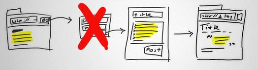
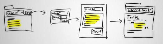
Blader door een blaadje voor ondernemers en er staan advertenties in van bedrijven die ERP systemen aan de man brengen. ERP systemen, in goed Nederlands: enterprise resource planning. Mooi natuurlijk dat dat kan, maar is het voor een klein bedrijf nu wel echt een voordeel? Zit je als kleine organisatie niet straks gewoon met een complex en ongebruiksvriendelijk systeem waarbij alles weliswaar digitaal en centraal is opgeslagen, maar de productiviteit niet positief wordt beïnvloed? In dit artikel ga ik in op de gebruiksvriendelijkheid van ERP systemen, en waarom het zo belangrijk is om daar op te letten.
Deze post is een vervolg op een alweer drie jaar oude post over ERP, MKB en nut).
Redenen om een ERP systeem te installeren zijn allereerst het verbeteren van de efficiëntie, ten tweede betere integratie tussen systemen en afdelingen en ten derde het reduceren van risico door verminderde fouten en het bieden van actuele overzich…
IMPORTANT: the assumption made here is incorrect. I suggested using a hashing function, but one should make a special message authentication code function such as HMAC…
A thing I've been rediscovering as of late is the bookmarklet. Not that I use many, but in contrast to many of the browser extensions, bookmarklets are really minimalistic and hence very simple to use (although installing them on mobile devices is not) pieces of software. Currently I use the Tumblr, Instapaper and Pinterest bookmarklets, but they all share a common problem: they require you to authenticate before you can actually use them.
Not satisfied with the third parties, not satisfied with hot they work…
I'm using the Tumblr blogging service simply because it makes posting, via its bookmarklet, easier than posting s…
Ontwikkelingen gaan te snel om allemaal bij te houden, dat is wat blogs en tijdschriften je graag willen vertellen. Daarom móet je hen ook volgen. Als je alle nieuwe media trends en technieken echter wilt kennen heb je geen tijd meer over om echte dingen te maken. Geen tijd meer om plezier te beleven aan het bouwen van iets, noch tijd om er aan te verdienen.
Gelukkig zitten er achter veel hypes vaak dezelfde concepten die voortborduren op jaren lopende trends. En die zijn best wel te volgen. Zo stuitte ik onlangs op een artikeltje dat ik negen jaar geleden had geschreven over webstandaarden. En in de basis klopt nog steeds (hoewel we ons nu niet meer druk hoeven te maken over Netscape 4.x). Wanneer je over andere soorten displays (waaronder auditieve) nadacht, dan kon je al weten dat Flash en pixelperfect design nooit duurzaam kunnen zijn, en op den duur vervangen moeten worden (‘hypes’ die het goed doen zijn nu responsive design, …