TL/DW: .css_day#ui-special
Yesterday I attended the CSS Day conference. This year only the first day, that focussed on designing user interfaces, less the building of it. Here are the key take aways for those who thought going through all slides is too long, or didn’t went.
Josh Clark - A.I. is your New Design Material
Josh urged designers to get feeling for the new design material called AI, the next big thing. We need to know what makes it different, the grain, and also know how we can use it for good. Design might have a seat at the board table, but they need to know how to align user considerations with business goals. More on AI and design by Josh Clark and more.
Steph Troeth - Behind the story
Storytelling used to be all the rage before mobile entered the scene, Steph recalls. Nevertheless, people prefer stories over plain lists of facts, and it can help us designers, but moreover the teams we work in, understand the user better and craft better user experiences. She inspired with mentioning different story lines, especially Kurt Vonnegut sprung out on the shapes of stories. Be careful not only to focus on the happy stories only though, look for diversity in your stories.
Başak Haznedaroğlu - A New Era of Design Process & Culture
Başak overloaded me somewhat with a stated as truths. But some interesting things came up, like what should be in a design system. Not only buttons and cards, but also colours, keyboard short cuts, writing style and even guides to come up with proper naming. Or on the definition of done, how it should also include design alignment.
Hakim El Hattab - Building Better Interfaces
I love the experimentation Hakim is doing. Playful. But he also is thoughtful when it comes to user interactions that he crafted from the ground up for his company Slides.com. The main take away: keep the interaction where the user initiated the action, e.g. loading indicators in the button that triggered the loading, menu’s where they open. Some cool crafting went into making what might be the best hover menu
Brad Frost - The Technical Side of Design Systems
Brad learned us how to properly set up a design system with the chaos of technologies of yesterday, today and tomorrow. Basically: start with a small project that is visible and will be celebrated widely when it delivers, break it properly down into atoms (check his book Atomic design), make the design system and craft the new experience. In between you might even make a small component library (but ideally create the design system as technology agnostic as possible). In hind sight, my gut was right. The talk by Brad Frost can be viewed on YouTube
Joe Leech - Psychology and your Product
Joe used his background in psychology to explain common pitfalls in designs. How not adhering to design axioms (“a statement or proposition which is regarded as being established, accepted or self-evidently true”) is confusing (like search and user stuff should be top right; but no, hamburger menu’s (≡) aren’t there yet). Be absolutely clear. Lot’s of icons are confusing (magnifying glass can mean search or zoom) (see also The best icon is a text label). And be careful when changing habits.
Stéphanie Walter - Pretty, but not Usable
Stéphanie talked about the problems that arose (and arise) simply from developers and designers not communicating. Sure, building stuff is expensive, but allowing designers to design anything in vacuum and developers trying to build stuff as quickly as possible using frameworks is a recipe for disaster. Together they often can craft pragmatic and yet beautiful outcomes.
Jared Spool - Beyond the UX Tipping Point

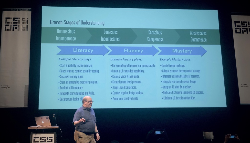
Jared needs no introduction, as the wonderful host of this day, Sara Soueidan, said: Jared was already working in UX before most of us were born. Jared talked about learning. Not only as an individual (from unconscious incompetence, to conscious incompetence, then competence, to unconscious competence), but also as teams and orgs (No UX, to spot UX design, to UX design as a service inside an org, embedded UX designers, to finally(?) infused UX design where everyone has at least a basic understanding and designers can focus on the bigger picture). He illustrated his point with the horrendous experience that Disney Parks online was in the nineties. But a few years ago they introduced a billion dollar band and it was perfectly executed. Everyone in the company seemed to know how to create perfect experiences. To get there, no influencer in the company should be left behind not knowing about UX. He offers courses, but some small tricks: immersive exposure (2 hours per 6 week every member should ideally do a field trip, or UI test). The company should have a shared experience vision (what’s next to improve the customer journey map). And the company should have a culture of continuous learning. Try adding the question “what is the most important thing you have learned and how will it change the future?” to your daily stand-ups.
It was a great and inspiring day. Thanks to the organizers, and I’m pretty sure I’ll sign up for next year.