Yesterday I attended the CSS Day conference. This year only the first day, that focussed on designing user interfaces, less the building of it. Here are the key take aways for those who thought going through all slides is too long, or didn’t went.
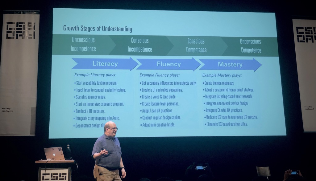
Josh Clark - A.I. is your New Design Material
Josh urged designers to get feeling for the new design material called AI, the next big thing. We need to know what makes it different, the grain, and also know how we can use it for good. Design might have a seat at the board table, but they need to know how to align user considerations with business goals. More on AI and design by Josh Clark and more.
Steph Troeth - Behind the story
Storytelling used to be all the rage before mobile entered the scene, Steph recalls. Nevertheless, people prefer stories over plain lists of…
- delicious 15 Apr Humane by Design
Don't try to be more personal
Your persona's don't include someone who is visually impaired Your persona's are probably all white, or typically young and dynamic. None of your persona's went through a tragic event recently.
Be careful when creating emotional experiences for the lucky ones. You shouldn't congratulate everyone with another great year, and/or a better year to come. Don't try to be more personal than you can be.
See also this thread on persona's
Should everything be designed invisible?
In an earlier post I wrote about invisible design and it might have seemed that I am a big proponent of invisible design. It is, however, important to distinguish between invisible design as a design approach where designery attributes are not being articulated and design where the sole purpose is to design experiences with no user interface at all. (Visible) user interfaces may actually play an important role in creating seemingly undesigned and invisible experiences by making them frustration- and stressless; invisible can be frustrating.
Invisible can be frustrating
The technology that powers the promised invisible interaction is not really “just not there”. To understand how something works it is sometimes good to reveal something about how it works, instead of hiding it away. Especially since every now and then, how well designed a system may be, ‘errors’ can occur. These errors may be technical errors, but also…
Invisible design
Wired explaining that the movement towards invisible design1 should be nothing new to desingers:
> In the early 1980s, Dieter Rams laid out his now canonical 10 Principles of Good Design. Rams taught us that great design is as little design as possible. It doesn’t draw attention to itself; it merely allows users to accomplish their tasks with the maximal amount of efficiency and pleasure. At its best, it is invisible.
btw: the link to a less secondary article was added by me, it is Ram's 10th principle
Wired is stretching Dieter Rams famous “less is more” design attitude to the logical max: nothing left (the extreme of less) is invisible. Hence follows: good design = invisible design.
Rams is popular among designers in de digital sphere. [Oliver Reichenstein, famous for his design agency iA and …
Laat je niet verleiden
Gekscherend heb ik loterijen ook wel eens belasting op domheid genoemd. Ik vind dat eigenlijk niet kunnen. En daarom moet het voorkomen worden. Loterijen zijn niet veel anders dan oplichtingsmachines die verleiding gebruiken als dark pattern. In dit stukje reken ik het een en ander op biervilt-niveau.
Stel, je koopt een lot van de postcode loterij voor €12,50 (bron postcodeloterijsite, op 26 januari 2015). Ongeveer 35% hiervan wordt uitgekeerd (zo'n 50% gaat naar goede doelen, en de overige 15% is voor de organisatie; bron). Gemiddeld verlies je per lot dus €8,13 (waarvan, het mag gezegd worden, ongeveer €6,25 naar goede doelen gaat en €1,88 naar feestjes, directie, medewerkers automatiseerders en indirect de staat (loonbelasting e.d.)).
De beperking op het verlies van de volledige €12,50 per lot is echter bij de deze en andere niet-staatsloterij-loterijen veelal niet 100% van jou. In Nederlan…
- shared 17 May ´12 Twitter and Reddit as crowdsourced fact-checking engines
- shared 04 Apr ´12 Volledig zijn, of reacties uitlokken? : Dode Bomen
Gegevens moeten zo min mogelijk onderweg zijn
Zou het mogelijk zijn om vuistregel te definiëren voor of iets nu beter een online applicatie kan zijn, draaiend op een externe server, of een lokaal draaiende app? In de evolutie van computer systemen lijkt het er op alsof we steeds zitten te flip-floppen tussen het draaien van de applicatie op het apparaat dat we gebruiken en het draaien van de applicatie op een apparaat ver weg. Vroeger hadden we terminals gekoppeld aan mainframes, toen kwamen er desktop PC's die alles lokaal deden en nu twijfelen we tussen Apps lokaal en webapps in “de cloud”, ook ik.
Gevoelsmatig zeg ik (op dit moment): Krantenapps? TV apps? Geen lokale apps: gewoon volledig online. Fotografeer apps, tekstschrijf apps, zinvol, waarom online doen? Maar het interessante is natuurlijk het grijze midden. De door jouw geselecteerde muziek? Een feedreader, met feeds die jij hebt geselecteerd? Schrijfapplicaties die je in staat stellen samen te werken…
It's digital stupid
Notes by Luke Wroblewski on the Martin Belam (Guardian) talk at EuroIA:
> Up front, the team did not get their API model right. They tried to use ISBNs for books and did not heed advice that ISBNs are “evil”.
Sounds quite familiar :)
> They (ISBN numbers, ed.) are a physical system not a digital system. They don’t identify a unique work but a specific edition. They don’t cover anthologies, they are added to CDs, calendars and even card displays.
Lately I've been wanting to slam my head quite a couple times for a similar reason: not choosing the right identifier. While much of the data I work with lately has multiple codes/numbers that look like unique identifiers usable in the digital environment I am building. None of them, however, fitted my desired digital world view. While I could have adopted the real world view underlying the existing identifiers, that view did not fit the …
Mobile feature creep
In this text causes and effects of feature creep in mobile telephones are being discussed. The problem with feature creep is that adding more features makes mobile telephones harder to use. Instead of paying attention to the ease of use of a telephone, most companies are only concerned with offering more features than the competitor. And the customer is debit to this behaviour.
Customers want features and therefore companies are offering them features. And since the competition can always offer more features, thus making their phones more attractive to the customers, all competitors try to stay ahead, giving rise to even more, seemingly needless, additions.
Due to the increasing number of features mobile telephones are also becoming increasingly hard to use: there is an inverse relation between the two. This inverse relationship can be demonstrated by making the one of the most simplest devices more complex: light switches. One light switch on a wall is simple to operate, yet…
Dit artikel van murblog van Maarten Brouwers (murb) is in licentie gegeven volgens een Creative Commons Naamsvermelding 3.0 Nederland licentie .