Save icon 💾
Not so long ago I was back in an organisation that was using Outlook Webmail. It may not have been the latest & greatest but I noticed this server (semi-cloud) based e-mailing app still used a floppy as a save icon. Being a mac user for years it felt weird…
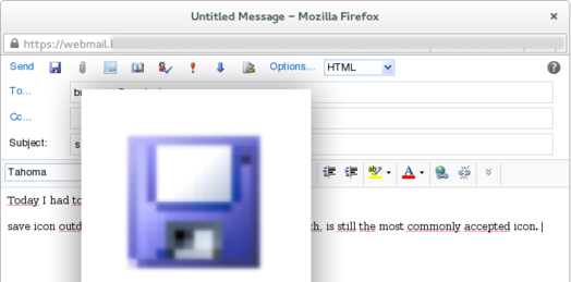
As you can see the icon that the webmail client features is a floppy
I didn’t pay much attention to the issue, until my friend lent me his Windows-phone:
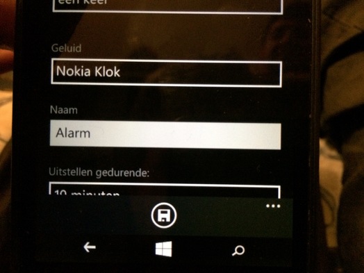
This total redesign (Metro-style) of how a phone could work and look still featured a floppy icon(!). And even though I’m not a skeuomorphism-hater, I prefer the simple label “Save” that Apple uses in iOS. The floppy icon on a Windows telephone is completely alien to the device. I guess you’ve all seen the joke about the 3D printed save icon somewhere?
Still, do a simple Google image search, and you’ll find that it is still the most commonly accepted icon.
There is hardly a save icon to be found in OS-X (Apple ditched floppy drives in 1998, 18(!) years ago). In the apps more native to OS-X you don’t have to think about saving really (other than naming the file) and otherwise there is the menu entry, with a label ‘Save’. Saving should be taken care of by the system, not you.
At the linux side of things: the Gnome desktop does have save icons, but its designers have found a bit more timeless metaphor for it: filing. “You file files”:

It makes more sense. Although I wonder whether this metaphor will survive the paperless age. When is the last time you’ve seen a filing cabinet?