murb hanteert een browser support grading systeem (een idee dat ik ooit heb gekregen van Anselm Hanneman bij het lezen van How to define a browser support level matrix) voor browserondersteuning. We classificeren browsers met een A, B, C of D.
Klasse
Omschrijving
A
Beste gebruikerservaring; alle features werken en weergave is duidelijk.
B
Alle features werken. Weergave niet altijd optimaal.
C
Basis functionaliteit werkt (in ieder geval rollen buiten controle (b.v. niet-admin functies)), maar geavanceerdere functies zijn niet altijd beschikbaar. Performance mogelijk niet optimaal.
D
Wordt niet ondersteund.
B2B projecten
Veelal kantoortoepassingen, complexe schermen, mobile support is een nice to have.
Klasse A Browsers:
- Google Chrome op Desktop (laatste en op één na laatste versie)
- Micros…
Apps are a great commercial succes. Every new operating system is claimed to be doomed. Still, most people use only 3 apps, 80% of the time (and 10 apps total 96% of the time).
While we cherish simple, little and focussed, these constitute a too limited view on what software could be. Not because simple, little and focussed is bad, but because many apps lack an important bit: interconnectivity. Most apps are silos.
We need integration
Integration nowadays is limited to simple sharing (typically ironically mostly urls) and a look and feel of the applications which is carefully described in Human Interface Guidelines that make things look integrated, like these: iOS UI guidelines and Android Material Design.
Still, wh…
Not so long ago I was back in an organisation that was using Outlook Webmail. It may not have been the latest & greatest but I noticed this server (semi-cloud) based e-mailing app still used a floppy as a save icon. Being a mac user for years it felt weird…
As you can see the icon that the webmail client features is a floppy
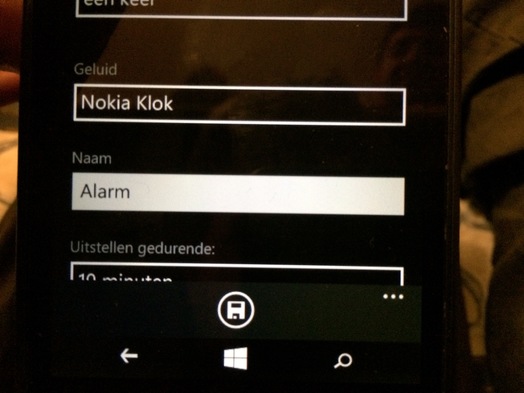
I didn't pay much attention to the issue, until my friend lent me his Windows-phone:

This total redesign (Metro-style) of how a phone could work and look still featured a floppy icon(!). And even though I'm not a skeuomorphism-hater, I prefer the simple label "Save" that Apple uses in iOS. The floppy icon on a Windows telephone is completely alien to the device. I guess you've all seen the joke about the 3D printed save icon somewhere?
Still, do a [simple Google image sea…
In this text causes and effects of feature creep in mobile telephones are being discussed. The problem with feature creep is that adding more features makes mobile telephones harder to use. Instead of paying attention to the ease of use of a telephone, most companies are only concerned with offering more features than the competitor. And the customer is debit to this behaviour.
Customers want features and therefore companies are offering them features. And since the competition can always offer more features, thus making their phones more attractive to the customers, all competitors try to stay ahead, giving rise to even more, seemingly needless, additions.
Due to the increasing number of features mobile telephones are also becoming increasingly hard to use: there is an inverse relation between the two. This inverse relationship can be demonstrated by making the one of the most simplest devices more complex: light switches. One light switch on a wall is simple to operate, yet…
