Save icon 💾
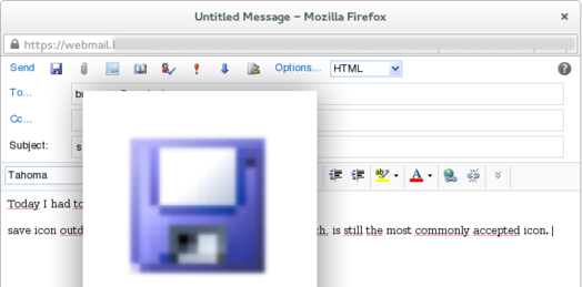
Not so long ago I was back in an organisation that was using Outlook Webmail. It may not have been the latest & greatest but I noticed this server (semi-cloud) based e-mailing app still used a floppy as a save icon. Being a mac user for years it felt weird…
As you can see the icon that the webmail client features is a floppy
I didn't pay much attention to the issue, until my friend lent me his Windows-phone:
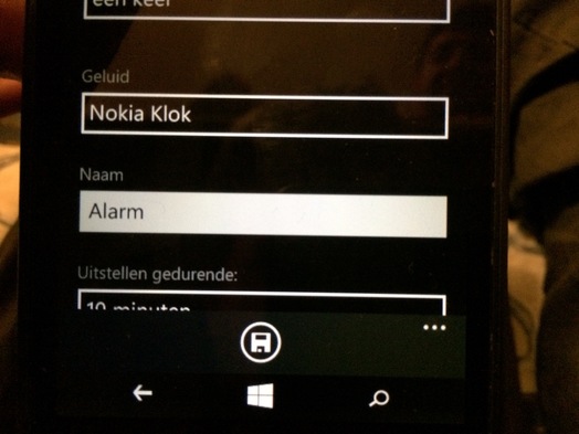
This total redesign (Metro-style) of how a phone could work and look still featured a floppy icon(!). And even though I'm not a skeuomorphism-hater, I prefer the simple label "Save" that Apple uses in iOS. The floppy icon on a Windows telephone is completely alien to the device. I guess you've all seen the joke about the 3D printed save icon somewhere?
Still, do a [simple Google image sea…
