Some observations on headings in sections elements in HTML.
Below demonstrates that the h1-element adjusts it's appearance level based on the section element. This is conform the standard. It is behaving like the h-element as I remember it being proposed with XHTML2. When inspecting the attributes in Firefox's accessibility inspector, however, the level attribute is still equal to the element's number. Also, this increase in appeared header-level doesn't change for h2-elements and up.
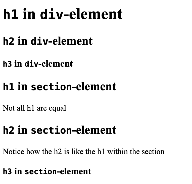
Example
h1 in div-element
h2 in div-element
h3 in div-element
h1 in section-element
Not all h1 are equal
h2 in section-element
Notice how the h2 is like the h1 within the section
h3 in section-element
Occasionally I still have discussions about px-based font sizing, feeling like the other party has lived under a rock since early 2000's. But some designers still like their pixel based tools; maybe it even got popularised again by relatively new tools like Sketch and Figma, introducing pixel-units in a vector-based tool.
Well, to be honest, it matters less these days when compared to the days I learned that pixels are bad. Those days browsers were enlarging only text when it used relative sizes. In response to not all sites serving relative font siz browsers have introduced full page zoom functions, which is common place these days, when you press Command/Control plus ‘+’ everything will scale; text images etc.
But the text-size function is still used. In Firefox, Settings > General > Language and appearance sets the default font-size. In Chrome: Settings > Appearance > Lettersize. When you’re young and able you probably wouldn’t need to know about these things. But we shoul…
Meer mensen bereiken, waarom dan niet alle mensen? Een paar weken geleden volgde ik een cursus van Peter van Grieken van Frozen Rockets. Hij wees ons er op dat 300.000 mensen in Nederland slechtziend of volledig blind zijn. Daarnaast zijn er bijna 700.000 mensen die kleurenblind zijn en dan hebben we 825.000 dyslectici en 1,5 miljoen laaggeletterden nog niet geteld. Doe je veel met video of geluid dan is het belangrijk om te weten dat er ook nog eens 1,3 miljoen mensen slechthorend of doof zijn. En dat naast 1,5 miljoen lichamelijk beperkten. Dat zijn 4 miljoen mensen met enige vorm van beperking (bron).
Screenshot van het project "Wayfinding for the blind", een onderzoek dat ik tijdens mijn studie (2006) mede had opgezet op de TU/e.
Het was schokkend om te zien dat zelfs grote sites als die van CoolBlue eigen…