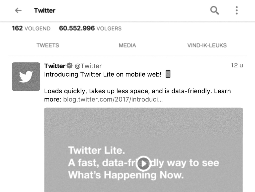
Targeted at those with low spec phones, Twitter today launched Twitter Lite, a product build on a modern suite of technologies that should be ring a bell with most front-enders today.
The new Twitter frontend is built using React (nb. made by Facebook), Redux, Normalizr, Globalize, Babel, Webpack, Jest, WebdriverIO, and Yarn (they have written about how they built it.
It is a good thing to see a large company not giving up on the open web. I’ve added the new Twitter Lite app to my phone (running iOS) and see if it can replace the native app (as I did with Facebook before). My first impression is pretty good. Most importantly, as promised: it loads faster, even without support for ServiceWorkers (while iOS 1.0 only allowed for web apps, its level of support is kind of bleak when compared to the efforts made by Google and Firefox). It could use some animation …
- mastodon 06 Sep ´24 Loving @murena 's e/OS so f...
- delicious 12 Oct ´16 Building tabbar hybrid apps with Turbolinks 5
- delicious 12 Oct ´16 Sim Daltonism
We don't need more silos
Apps are a great commercial succes. Every new operating system is claimed to be doomed. Still, most people use only 3 apps, 80% of the time (and 10 apps total 96% of the time).
While we cherish simple, little and focussed, these constitute a too limited view on what software could be. Not because simple, little and focussed is bad, but because many apps lack an important bit: interconnectivity. Most apps are silos.
We need integration
Integration nowadays is limited to simple sharing (typically ironically mostly urls) and a look and feel of the applications which is carefully described in Human Interface Guidelines that make things look integrated, like these: iOS UI guidelines and Android Material Design.
Still, wh…
Save icon 💾
Not so long ago I was back in an organisation that was using Outlook Webmail. It may not have been the latest & greatest but I noticed this server (semi-cloud) based e-mailing app still used a floppy as a save icon. Being a mac user for years it felt weird…
As you can see the icon that the webmail client features is a floppy
I didn't pay much attention to the issue, until my friend lent me his Windows-phone:
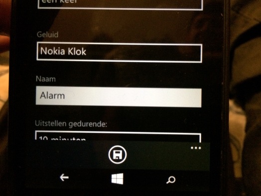
This total redesign (Metro-style) of how a phone could work and look still featured a floppy icon(!). And even though I'm not a skeuomorphism-hater, I prefer the simple label "Save" that Apple uses in iOS. The floppy icon on a Windows telephone is completely alien to the device. I guess you've all seen the joke about the 3D printed save icon somewhere?
Still, do a [simple Google image sea…
- twitter 13 Oct ´14 #iOS allows you to set access to your #location to never & always. But some have ‘when in use’. How to set to this value for all apps?
- delicious 22 Sep ´14 iPhone Tutorials - Ray Wenderlich
- delicious 25 Jun ´14 VPN disconnects when iPhone goes into auto-lock ? | Apple Support Communities
- twitter 23 Apr ´14 Does #iOS support #Lytro lightfield background #images for home screen? Would be nice :) parallax = faux depth
- delicious 12 Nov ´13 iOS7 GUI for Sketch (iPhone) | Teehan Lax
- twitter 24 Oct ´13 Suggestion for #NSA inspired by #LinkedIn's #iOS mail add-on (/mail reader): show the user whether the e-mail has been read by them.
Click me! Click what?
Well, iOS has gone flat. We've, as interaction designers/human-computer interaction-specialists, traditionally been taught that a button should look like a button. And as we heralded Apple for its great interaction design some tend to be a bit sceptic / pissed.
The idea that something you could click on should look like a button comes from the idea of affordances; a button should expose the affordance of click-ability (or tap-ability if you like). More or less like a chair exposes the affordance of sit-ability, like a lying tree trunk does.
Affordance is a concept introduced in human-computer interaction by Don Norman in the late eighties who derived it from James Gibson. Don Norman's original reading on the concept has been popularized quite a lot, whereas James Gibson's work hasn't (at least not in interaction design-schools). But Gibson's idea of affordance was quite different from Don Norman's simplification. Later Don Norman revised his original concept of affordance…
- twitter 21 Sep ´13 “Click me? Click what?” A new post on why #flat #UI's shouldn't be bad at all: http://murb.nl/articles/186-click-me-click-what- #iOS http://t.co/ak7b0BYuRC
- delicious 22 Jan ´13 Baker Ebook Framework 4.0
- delicious 08 Jul ´12 Reflection.app
- delicious 08 Jul ´12 Reflection.app
- delicious 29 May ´12 Rhodes / RhoStudio
- delicious 29 May ´12 Rhodes / RhoStudio
Gegevens moeten zo min mogelijk onderweg zijn
Zou het mogelijk zijn om vuistregel te definiëren voor of iets nu beter een online applicatie kan zijn, draaiend op een externe server, of een lokaal draaiende app? In de evolutie van computer systemen lijkt het er op alsof we steeds zitten te flip-floppen tussen het draaien van de applicatie op het apparaat dat we gebruiken en het draaien van de applicatie op een apparaat ver weg. Vroeger hadden we terminals gekoppeld aan mainframes, toen kwamen er desktop PC's die alles lokaal deden en nu twijfelen we tussen Apps lokaal en webapps in “de cloud”, ook ik.
Gevoelsmatig zeg ik (op dit moment): Krantenapps? TV apps? Geen lokale apps: gewoon volledig online. Fotografeer apps, tekstschrijf apps, zinvol, waarom online doen? Maar het interessante is natuurlijk het grijze midden. De door jouw geselecteerde muziek? Een feedreader, met feeds die jij hebt geselecteerd? Schrijfapplicaties die je in staat stellen samen te werken…
- shared 09 Nov ´11 Everybody Wins
Dit artikel van murblog van Maarten Brouwers (murb) is in licentie gegeven volgens een Creative Commons Naamsvermelding 3.0 Nederland licentie .